
PROJECT & TIMELINE
0-1, from concept to launch
Dec 2023 - Apr 2024
MY ROLE
Lead Product Designer, collaborating with:
Product Team: 1 PM, 1 UXR, 1 DS
Engineer Team: 2 Engineers
Sales Team: 4 Sales Representative
MY CONTRIBUTION
User Research
Competitor Analysis
Product Design
Workshop Facilitation
Stakeholder Alignment
Prototyping & Testing
Whova is an event management platform to help organizers handle event planning from start to finish—including registration, agenda planning, attendee check-in, and more.
As part of a 0 to 1 initiative, I led the design of a new Booth Selection feature to solve a long-standing pain point in exhibitor management. Organizers were managing booth assignments manually in spreadsheets—leading to confusion, errors, and time-consuming coordination. I partnered closely with the PM, engineering and sales team to design an integrated solution that organizers to set up booth maps, assign spaces, and manage post-registration changes all in one place—reducing time spent, improving visibility, and streamlining operations for 300k+ events.
Whova’s registration system supports ticketing and attendee management across different roles—attendees, sponsors, and exhibitors. However, for events with exhibitors needing physical booths, booth assignment wasn’t included in the registration workflow.
Organizers had to wait until registration closed, export the exhibitor list to Excel, and manage booth assignments manually—often juggling spreadsheets, email threads, and last-minute changes.
🧾 +30% Time spent on manual booth assignment
Without a feature to manage booths, organizers had to assign booths manually post-registration and keep everything in spreadsheets.
🔁 Hard-to-track process
Manual work made it difficult to track updates and adjust assignments as needs changed.
⚠️ Increased risk of error
Limited visibility and fragmented worflows led to more mistakes and miscommunications.

"Is there any way that we can have exhibitors choose their own booths during registration?”
"I have to assign booths to my exhibitors after they register and add the booth numbers to their profiles on Whova individually, and I have to do this for 100-200+ exhibitors."

Given limited time and resources, we prioritized a targeted 0-1 solution to addresse the most pressing user pain points over a time-consuming rollout—aiming for fast, measurable results. The process of defining the project scope and iterations was driven by measurable primary and secondary goals.
HIGH LEVEL GOAL 1 - BUSINESS
Feature Adoption & Conversion
Ensure feature adoption without disrupting existing ticket and registration setup workflows.
Secure user satisfation and boost Whova registration buy-in and retention.
🔹 Feature adoption rate
🔹 Whova registration retention rate
🔹 Impact on % organizers using Whova Registration
HIGH LEVEL GOAL 2 - USER
Experience
We took an objective approach in design and testing to ensure:
Learnability: Users should be able to understand and use the feature with little to no guidance.
Efficiency: Users should be able to complete booth setup quickly and move on.
Error Prevention: The feature should minimize the risk of mistakes during booth setup.
🔹 Average time to complete booth assignment
🔹 Drop-off rate during setup
🔹 Support tickets related to booth assignment
Organizers set up an interactive booth map as part of exhibitor registration and track the entire booth assignment process in one place. Within 3 months of launch, we saw significant results:
Saved time on initial booth assignment
Feature adoption 3 month after launch
Whova Exhibitor Registration buy-in
Customize booth tier - Reduced decision fatigue
Pre-assign color to each exhibitor ticket tier to represent different booth tier.
Switch tier color efficiently from the provided color palette.
Place pins on map - Efficiency focused & Error prevention
Dedicated top sections for instructions and quick booth tier switching.
Click to place a pin; edit details on the side; drag to reposition as needed.
Booth selection preview - Status visibility
Search by exhibitor name for the booths taken or reserved.
Filter by booth tiers and booth status.
View booth and exhibitor details right on the map.
At project kickoff, we had no clear requirements—only customer requests from support about having such a feature that allows exhibitors to choose their own booths.
To bridge the insight gap, I collaborated with the PM and research team to conduct user interviews and a survey, and led a round of competitor analysis. The insights we uncovered helped clarify the problem space and shaped the foundation for later project scoping.

Survey & User interviews
INSIGHTS
Booth assignment varies by event size. Smaller events are more flexible and open to adjustments, while larger ones tend to follow set rules based on:
Ticket tiers: higher tiers get better locations and larger booths.
First-come, first-serve: changes are allowed upon request.
Exhibitor preferences: e.g., avoiding competitors or choosing spots near key facilities

Competitor Analysis
INSIGHTS
Organizers might already be familiar with certain UX patterns used in other products and expect new features to align with those standards:
Side-by-side map and booth list display.
Interactive maps with various interactions.
Search and filter functions.
🤔 Some competitors offers Map Builder
Following the completion of research and analysis of the suggested features, my next step was to determine the feature positioning and establish feature implementation priorities.
We considered customer needs, impact on existing features and system, technical feasibility, and required resources, ultimately landing on a balanced solution for this milestone.
[JTBD] As an event organizer who needs to assign booths to registered exhibitors, I want to set up a venue map and map each booth to an exhibitor tier on the map, so that exhibitors can easily select from the booths during registration without me manually assigning them.
Upload a venue map with booth layout pre-defined, so the system can support booth selection without starting from scratch.
Map each booth to an exhibitor tier so that exhibitors can view and select according booths during registration.
Reserve certain booths to premium exhibitors
Track which booths have been claimed and by whom to avoid double-booking or confusion.
Make real-time updates or corrections if booth assignments or availability change.
To guide both the design and technical implementation, I broke down the experience into 3 bite-sized steps—each tied to a core job the user needed to accomplish. Rather than looking at each screen in isolation, I considered how every step connects with existing features to ensure a smooth, integrated workflow.

When exploring where to introduce Booth Selection, I considered multiple entry points—each with trade-offs in visibility, complexity, and potential disruption.
Guided by our core principle of ensuring adoption without disrupting ticket or registration setup, I mapped out the pros and cons and presented them to the team, and finally aligned on an entry point that felt intuitive, low-friction, and easy for users to adopt.

Why we chose this
Picked 🔵
Exploration 1
Exploration 2
Individual feature item in the side menu
Higher feature visibility that aligned better with business goals
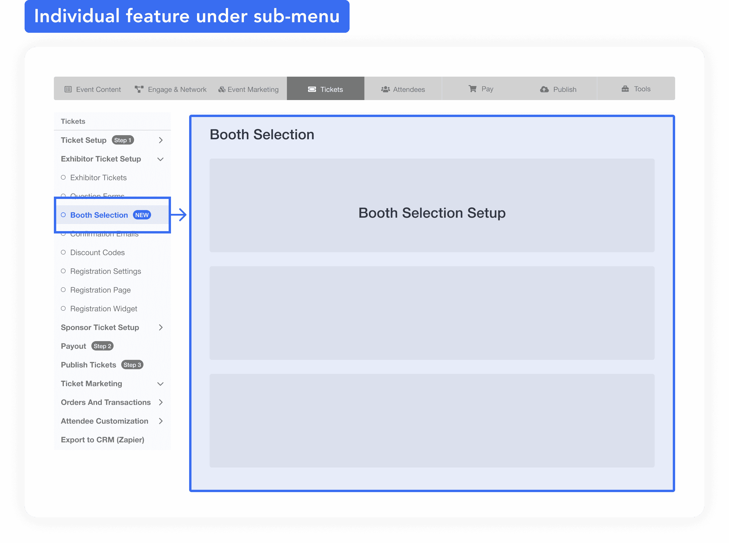
✅ Higher visibility as a menu item, which supports better feature adoption.
✅ More space for onboarding, with a dedicated page to explain benefits and setup steps.
❗ Less clarity in flow order between ticket setup and booth selection—but manageable as an edge case in later iterations.
Side-by-side tab view of ticket and booths
Mapping each booth tier with a ticket tier right away
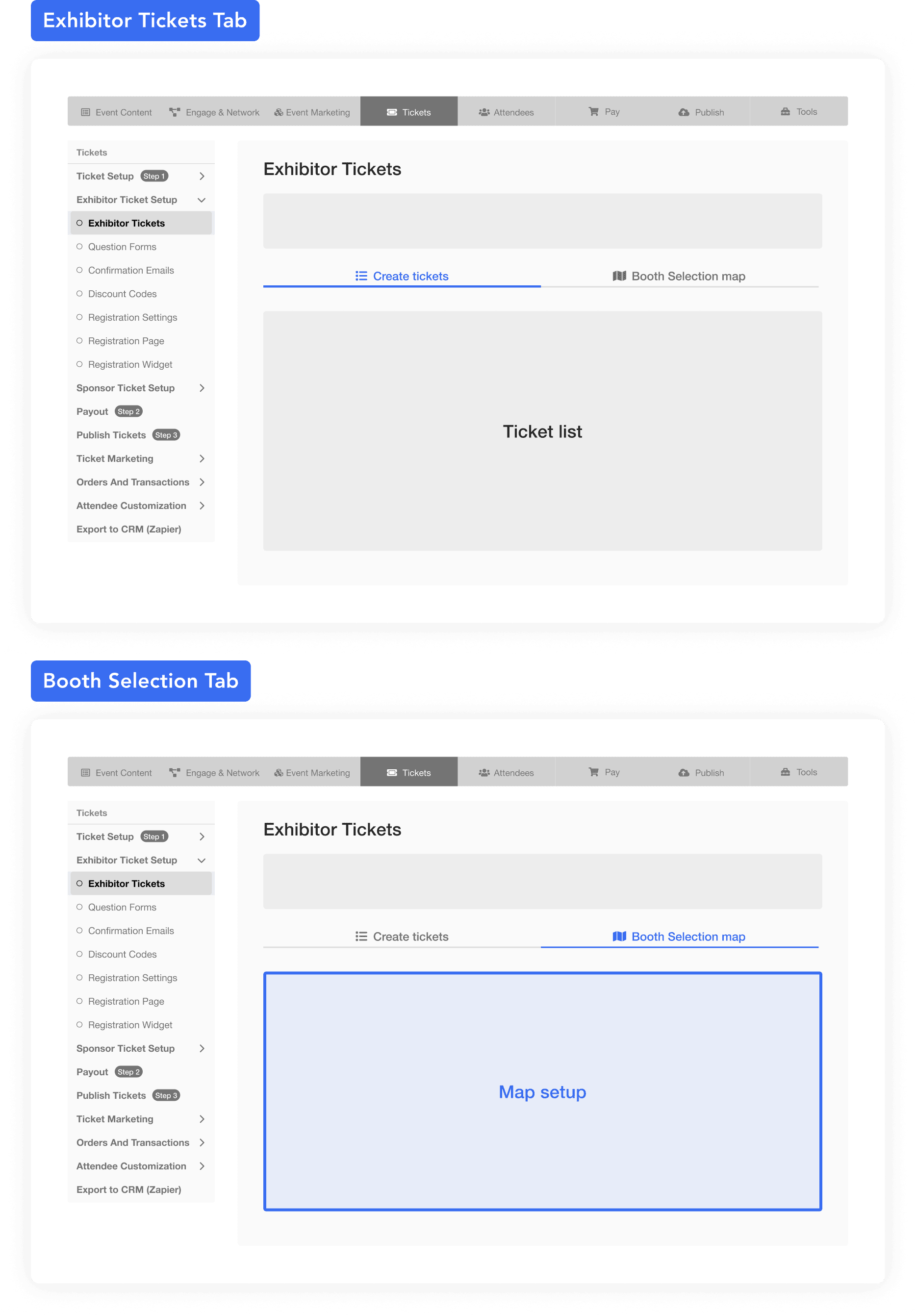
✅ Streamlined experience, keeping booth setup closely tied to ticket creation.
❗ Limited visibility and onboarding space, as the new feature is nested within an existing flow.
❗ High risk of disruption to a familiar and frequently used workflow, which could impact usability and adoption.
Booth Selection as the second step of ticket creation
Mapping each booth tier with a ticket tier right away
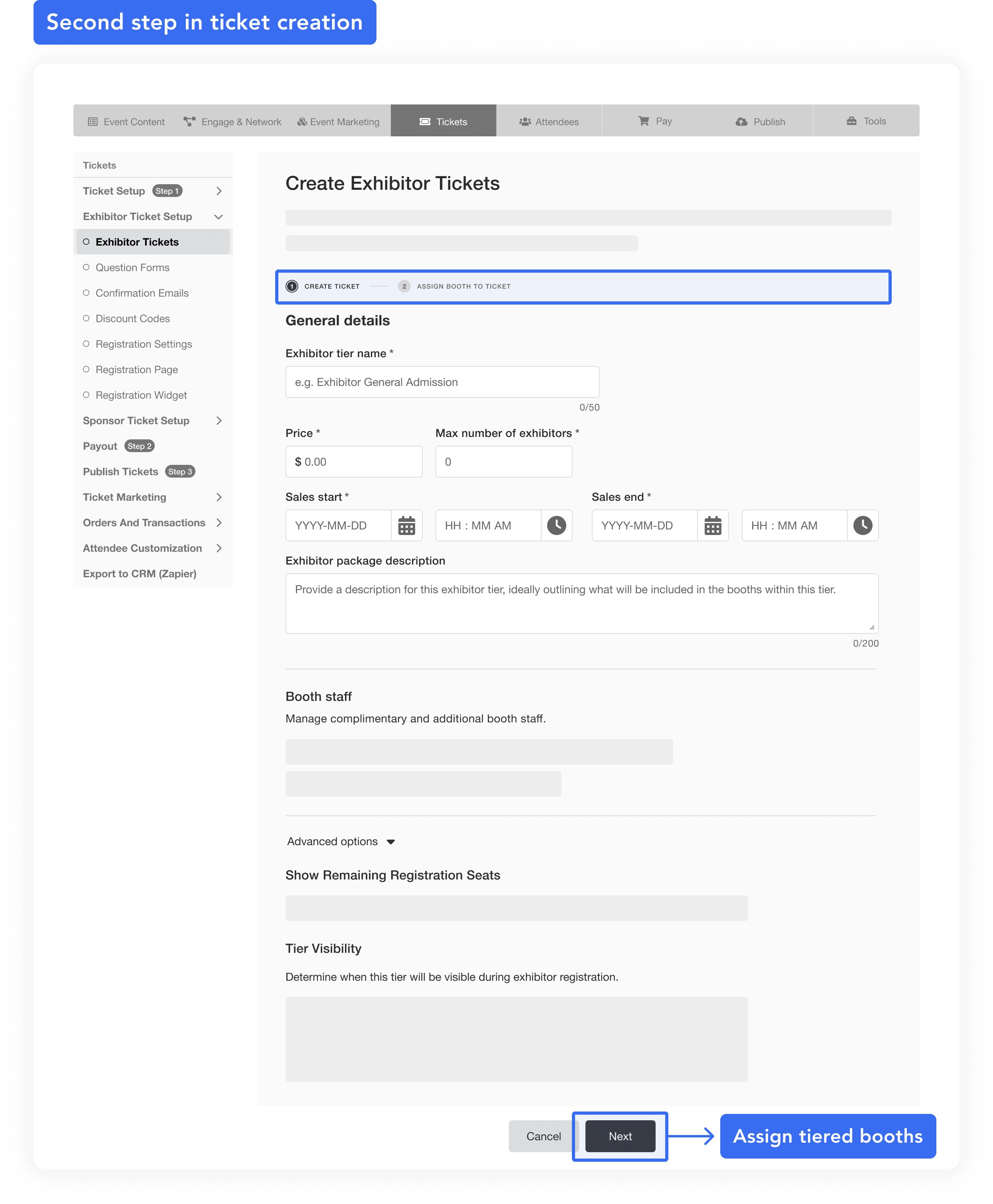
Higher feature visibility that aligned better with business goals
After creating paper wireframes for the key screens, I developed an initial design for the 3-step flow and conducted a round of design and stakeholder reviews (PM, engineers).
The goal was to confirm the overall flow and provide the engineering team with a foundation for assessing technical feasibility.

Peer reviews
Stakeholder reviews
User testing with sales team
During the user testing stage, it was challenging to reach and schedule sessions with our customer organizers within the limited timeframe.
As a result, I conducted testings with 2 designers and 3 sales representatives. Since the feature doesn't require extensive domain knowledge and sales interact with our customers daily, their feedback was valuable for evaluating usability.
📋 Tasks
Locate the feature to set up a map for exhibitors to select their booths during registration.
Upload a floor map to the platform.
Set up tiered booth information (with 5 pre-created exhibitor tickets).
Place pins on map as booth, and complete the setup for at least 2 booth tiers.
Modify the tier information for an existing booth.
|
|
|
|
|
|

|

|


The final and most critical task was refining map interactions to improve action discoverability and surface system feedback at key user touchpoints.
I explored hundreds of interaction patterns to make the experience feel more intuitive. Throughout, I regularly synced with engineers to assess feasibility and iterated based on feedback from design reviews and stakeholder demos —ensuring what we shipped felt polished, purposeful, and grounded in real use.

Good design makes things obvious and puts users in control
One of my biggest takeaways from this project was how important it is to make things feel obvious and controllable—especially in a B2B SaaS tool where users are trying to get things done quickly and efficiently. I focused less on accommodating every user preference and more on streamlining the steps that mattered most across the workflow.
Another thing that stood out was just how impactful good system feedback can be. For many of our users—who aren’t always the most tech-savvy—getting a clear signal that their action was successful (or not) makes a huge difference. Providing confirmations, alerts, and suggested next steps isn’t just a UX detail—it’s a safeguard that helps keep users confident and on track.
There's not perfect design process
Introducing a new feature always involves experimentation and occasional failure. I encountered situations where user behavior differed from my expectations and where design adjustments were needed due to technical limitations discovered by the team along the way.
Embracing this process as part of design process and communicating early and often helped me navigate these challenges effectively.
Sometimes you have to diverge before you can converge
Design systems don’t always have ready-made solutions for new, complex features—especially something as interactive as a map-based interface. Early on, I had to step outside the system to explore what the experience really needed. Once the direction became clearer, I worked back toward alignment, adapting my solution to fit evolving system patterns. This approach let me move fast while still contributing to the design system’s growth in a meaningful, forward-looking way.