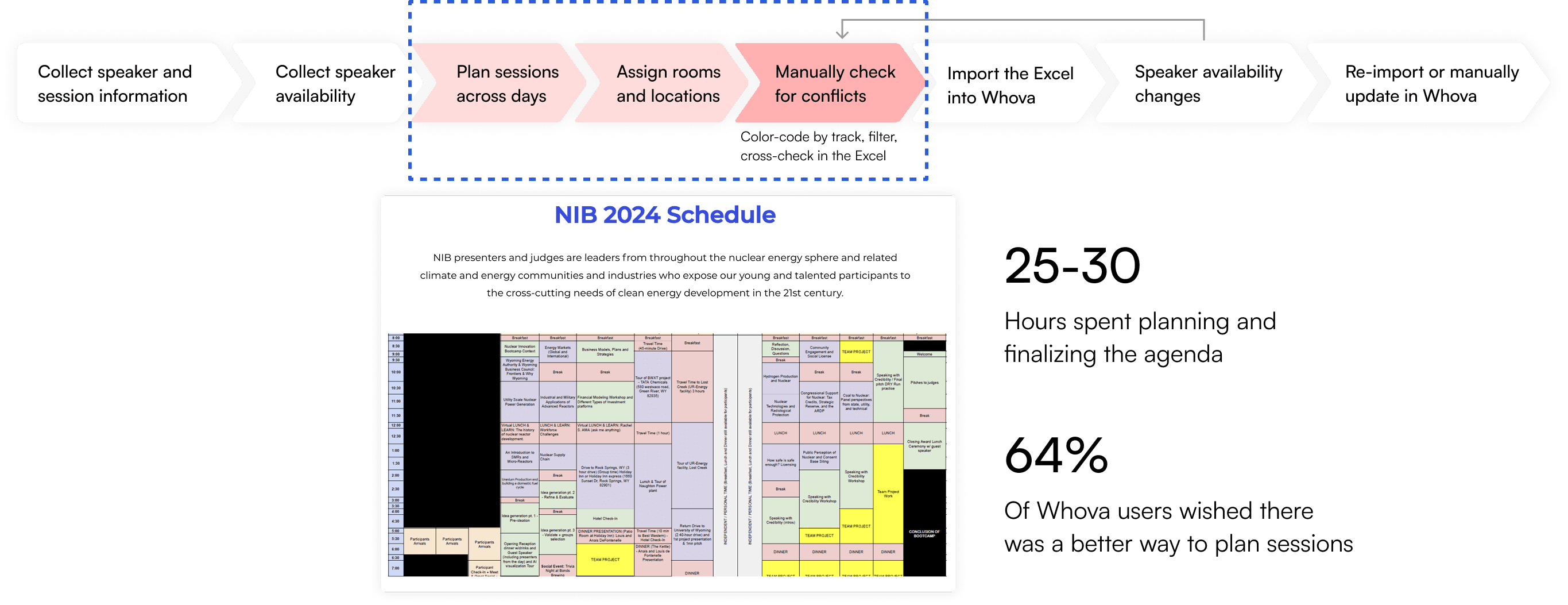
95% of events on Whova use the Agenda Center to manage their session schedules, with over 70% of them planning everything in Excel first, import into Whova after.
Organizers managing hundreds of sessions needed a way to quickly flag when two sessions conflicted. Without a built-in solution, they had to manually cross-reference every speaker, every room, and every time slot, hoping nothing slipped through.

01
User goal: Save time, reduce errors
Cut the hours organizers spent manually checking for conflicts and catch what slips through without back-and-forth adjustments.
02
Project goal: Find the right scope
Identify the conflicts organizers run into most, and determine what's feasible to support within our timeline.
03
Business goal: Close the workflow gap
Strengthen platform stickiness by closing the Agenda Center's biggest workflow gap.
We turned a manual, error-prone spreadsheet process into a configurable conflict checker. Organizers set up the conflict rules that apply to their event and get a report flagging the exact rows that need fixing. Less time hunting, more time resolving.
21%
Adoption rate among events with 100+ sessions
26
Median conflicts caught per event
2X
Faster conflict resolution

Hundreds of events launch on Whova every month, so getting something useful out quickly meant we'd have real data to work with sooner. Before jumping into design, I wanted to get clear on what we were actually trying to solve. I synthesized insights from organizer interviews the research team had conducted, then ran competitive analysis across 4 platforms and did 2 production audits to assess feasibility. The research pointed to two clear insights:

01
Always critical, supported by all competitors
Double-booked speakers
Double-booked rooms
Context-dependent and require more attention
Speaker availability
Room availability
Preferred time for specific sessions
Sessions must not overlap
Track conflicts
02
70%+ of Whova users import their agenda from Excel
💭
Support an upload-based flow. Meet organizers where their agenda lives.
The Agenda Builder page is already dense with actions
💭
Conflict checking needs its own space, not bolted onto an existing page.
Looking at what competitors had built, my first instinct was to go for something similar — in-platform scheduling with real-time conflict detection. But after seeing 70%+ of Whova organizers were importing their agenda from Excel, I realized that building that would mean asking most of our users to completely change how they work, just to use a new feature. That didn't make sense.
So I brought it back to the PM, and we scoped to something more focused:
Throughout the process, I had three principles to guide my work:
01
The conflict checker should feel easy to set up for both basic and power users.
02
The conflict rules should be fast to be established.
03
Results should be easy to understand and act on.
Research and competitor analysis pointed to a clear split: double-booked speakers and double-booked rooms are conflicts the system can check automatically — no setup needed. Everything else requires organizer input.
01 Explorations

02 Follow-up survey
50%+
of them only needed double-booked speaker and room checks. That's it.
03 Flow adjustments & Final design
✅
Segments users before they see any complexity.
50%+ of organizers get in and out without touching a single rule.
✅
"Set up custom conflict check" option also available to basic users.
✅
Stronger visual indication that basic conflicts are auto-checked.
Once organizers chose to set up custom rules, each rule type needed its own configuration. The key goal is to get each individual rule to feel quick and intuitive to set up.
I went through rounds of exploration, testing each internally and presenting to stakeholders to validate the interaction against how organizers actually think about when configuring the rules for different types of conflicts. Each round surfaced a clearer picture of the right mental model.

V1: Specifying speaker availability day by day
❌
Time-consuming to set up for multi-day events.
❌
Point of confusion: The UI couldn't tell you if leaving a date blank meant the date was unavailable or simply not yet filled in.

V2: Saving organizers' effort by pre-populating event dates
✅
All event dates presented to avoid manual entry.
✅
"Flexible schedule" checkbox allowed users to quickly indicate when a speaker is free for the entire day
❌
Wrong mental model: speakers typically only show up on the days they're presenting, but the design had no way to mark a day as unavailable.
Redesigning around how speakers actually show up
✅
Matches real behavior
Select the days they're there, ignore the days they're not.
✅
Default times pre-filled for available days
Users edit rather than enter from scratch.

Why we chose this
In this milestone, the fix happens back in the spreadsheet — not inside Whova. So the conflict report page had one job: make it as easy as possible for organizers to understand what's wrong and find the exact rows they need to fix in the file. I went through three structurally different approaches before landing on one that actually matched how organizers work.


❌
V1: The flat table layout cramped multiple columns, important content got truncated
❌
V2: Better layout, but a session with multiple conflict types still requires hunting across different sections.


✅
V3: Regrouping conflicts by session, listing all conflict types in one session card.

Fine-tuning the session-based layout for clarity and scannability
✅
All conflicts for one session grouped in one card to match the row organizers need to fix in Excel
Here's what that process delivered:
21%
Adoption rate among events with 100+ sessions
26
Median conflicts caught per event
2X
Faster conflict resolution