Thread Medical | Note editing & Note inbox redesign
PROJECT & TIMELINE
0-1 & Feature refinement
May 2022 - Aug 2022
MY ROLE
UX designer, project lead, collaborating with: Founders, 1 Product director, and 1 Engineer
MY CONTRIBUTION
User interviews
Competitor analysis
Product thinking
Wireframing
Prototyping & Testing
Thread Medical is an AI-powered medical scribe tool that transcribes doctor–patient conversations into structured clinical notes. It helps small and midsize practices reduce documentation time and minimize admin burden.
As the product moved toward Beta testing, the team aimed to better meet the needs of real-world clinical workflows. At the time, Thread Medical had only bare-bones functionality — lacking both the ability to edit generated notes and a robust inbox for managing patient notes, which were critical for physician trust and adoption.
As the lead UX designer, I conducted user interviews and competitor analysis to better understand the clinical context. After aligning on the project scope with the founding team, I led the end-to-end design of the note editing experience and optimized the note management workflow. Usability testing with physicians later revealed an early satisfaction rate of over 85%, validating key assumptions and helping drive product adoption and stakeholder buy-in during the Beta phase.
CHALLENGES & OPPORTUNITES
While Thread Medical’s MVP could record and transcribe conversations, it fell short in supporting how physicians actually review, modify, and manage notes in practice. The existing inbox was a simple chronological list, and there was no way to edit notes—limiting its usability in real clinical settings where accuracy and flexibility are crucial.
This gap presented both a challenge and an opportunity: how might we evolve the product from a passive transcription tool into an active part of a physician’s workflow? By mapping out the note lifecycle across different phases of a patient encounter and studying how clinicians interact with existing tools, our goal was to identify key moments where better structure, control, and clarity could drive adoption and trust.
Current production: Note inbox listing notes choronogically

Current production: Recording and transcribing conversations into note

BEFORE THE ENCOUNTER
Prepare
View patient history or previous notes.
Scan for key issues or follow-ups and identify areas to address during patient visit.
DURING THE ENCOUNTER
Capture
Start recording at the beginning of the visit.
Engage with the patient while Thread Medical transcribes in real-time.
AFTER THE ENCOUNTER
Review & Finalize
View the AI-generated clinical note.
Copy the note into the EHR system.
Make edits to match clinical standards or billing requirements.
DISCOVER
To understand barriers to market fit and clarify the needs of target users, I synthesized past research and conducted a preliminary competitor analysis during the first two weeks.
While awaiting pilot user interviews, I collaborated with the team to compile a research plan and draft a guideline for conducting in-depth interviews to make sure the research goals are clear with our limited timeframe, while also seeking resources to better understand how AI conversation recognition works.

After presenting the interview insights to the team, we identified two critical pain points that, if addressed, would have the greatest impact on the overall product experience. The RICE scoring model helped us to prioritize the user needs considering the limited timeframe and engineering resources at hand.
Primary
📝 Lack of editability causes trust issues
The inability to edit AI-generated notes creates friction:
Users are uncomfortable signing off on autogenerated notes they can't correct.
There’s a strong need for customization, including note formatting and reusable templates tailored to clinic or personal preferences.
Primary
📑 Users need efficient way to manage all notes
Current tools lack an efficient note inbox for quickly locating and managing notes, which slows down workflows in busy clinical settings. Users need:
A summary view of patient info before visits to prepare efficiently.
A quick way to create, locate, and revisit notes.
The ability to revisit and update notes over multiple days.
⛓️💥 Non-standard note format slows adpotion
Users are already familiar with their current EHRs. When the generated notes don’t follow expected structures:
It increases mental load.
Users are slower to adopt the tool, or revert to manual documentation.
🔌 Lack of integration slows down workflow
The current product operates in isolation from existing systems:
Users want seamless integration with their EHRs to support sign-off and billing processes.
TASK 1
Based on insights gathered from physician interviews and past research, we identified a core job physicians try to accomplish when managing clinical notes:
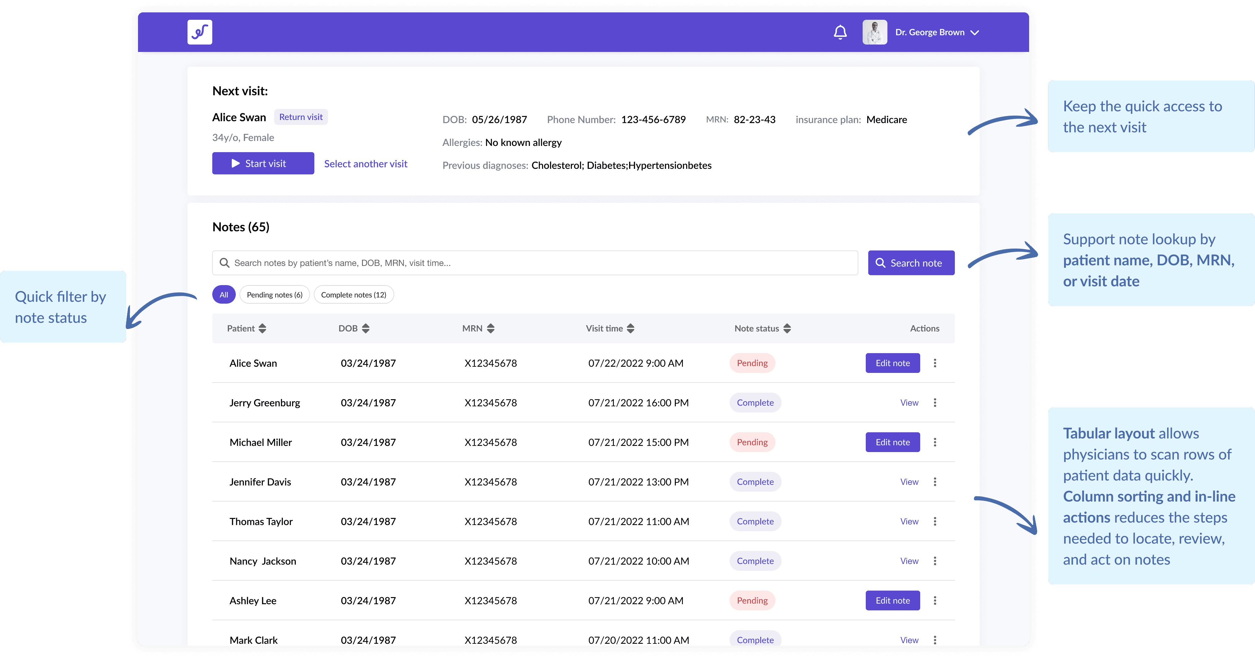
Current production: Note inbox

Jobs to be done - Note inbox
When managing a high volume of clinical notes, I want to easily locate pending or specific notes, so that I can prioritize my work and reduce time spent searching.
Outcome Expectations:
Quickly locate notes based on patient or appointment info
Identify and prioritize pending or incomplete notes
Reduce time spent navigating and switching between tools
Common rules:
[Search by Identifiers] Lookup by patient name, DOB, MRN, or visit date
[Note Status Indicators] Clear visual cues for pending, and completed notes
[Quick Access] Minimal steps to open, review, and take action on a note
Redesign: Note inbox
TASK 2
As part of the core clinic experience, the note editing flow needed to balance clarity with control. Our research showed that physicians primarily review AI-generated notes and only occasionally make edits—lacking a clear distinction between viewing and editing could potentially led to confusion and accidental changes.
I explored several design directions to address this, ultimately landing on a flow that separates passive review from intentional editing—reducing errors and aligning better with real-world physician workflows.
Current production: Note inbox

Jobs to be done - Note inbox
After a patient visit, I want to review and edit the generated notes to ensure accuracy and completeness, so that I can sign-off and move on to the next task.
Outcome Expectations:
Distinct separation between viewing and editing to prevent unintentional changes
Maintain alignment with physicians' familiar documentation workflows
Improve confidence and accuracy in final notes before sign-off
Common rules:
[Clinical Context] Access to referenced information (e.g., medications, history)
[Edit Mode] Dedicated "Edit Note" CTA to prevent accidental edits
[Interaction Patterns] Familiar controls that support quick additions and corrections
From note inbox to individual notes
After nailing down the high-level editing flow, I explored a range of interaction patterns to make note editing feel more intuitive and aligned with physicians’ mental models. A major focus was the Review of Systems (ROS) section, where dense, structured content often leads to inefficient documentation.
During early usability testing with physicians, I noticed that my initial design for editing ROS wasn’t as intuitive as expected. Users hesitated, made errors, or had to ask clarifying questions—all signs of friction. This feedback made it clear that the flow didn’t reflect how physicians naturally edit their notes.
Exploration 1 🔴
✅ Immediate editing of each symptom directly in the list
✅ Visible groupings by system
❌ Why it wasn’t adopted:
Low efficiency: Requires users to interact with every individual symptom one by one
Hard to quickly add new symptoms: "Add symptom" per section adds friction
Error-prone UI: Easy to mis-click a radio button while reviewing rather than intentionally editing
Exploration 2 🔴
✅ Clear separation between “reports” and “denies” per system
✅ Easier to edit or remove individual symptoms quickly
❌ Why it wasn’t adopted:
Too much reliance on dropdowns: Manually selecting system, symptom, and status every time is slow and repetitive
Hard to quickly add new symptoms: "Add symptom" per section adds friction
Limited discoverability: Symptoms aren’t surfaced unless selected—reducing awareness of available options
Final design 🔵
✅ Batch editing at scale: Allows users to select multiple symptoms at once, and apply "Reports" or "Denies" in bulk
✅ Reduced friction: Centralized modal supports focused, efficient symptom entry
✅ Familiar pattern: Modal + checkboxes + action buttons mirrors UI patterns physicians are already used to
Final flow: View and edit a note (prototype)
TASK 3
In the user interviews, we also saw physician's need for an easier way to review, locate, and follow up on patient notes alongside their daily schedule.
While the inbox redesign and note editing flow tackled immediate pain points, I also had some time left in my internship to think ahead. After discussing with the founding team, I designed a dashboard concept that could give physicians a high-level view of incomplete tasks and quick access to patient notes, helping them stay organized and proactive throughout the day.
Dashboard concept

During my internship, the greatest challenge was the limited time frame for organizing complex information and creating experience for a new feature. The team expected me to quickly integrate into the design process. It forced me to prioritize and make efficient decisions to deliver the MVP effectively.
While it was tempting to explore all possibilities of new features that could enhance the overall user experience, I had to ensure that the designs I proposed were feasible within the team's resources and capabilities. This experience taught me the importance of aligning design ideas with project constraints and making informed decisions that balance ideation with practicality.
Recognizing the importance of tailoring designs to specific devices, I learned to adapt my approach to accommodate user preferences and interactions on each platform. This insight has significantly influenced my subsequent design projects, as I now consider device-specific considerations to create optimal user experiences.