Whova | Smart Booth Selection

Whova | Smart Booth Selection

Detect. Review. Confirm.

Detect. Review. Confirm.

Detect. Review. Confirm.

Detect. Review. Confirm.

Cutting Booth Selection setup time with AI-assisted detection that adapts to any map organizers upload.

Cutting Booth Selection setup time with AI-assisted detection that adapts to any map organizers upload.

Cutting Booth Selection setup time with AI-assisted detection that adapts to any map organizers upload.

PLATFORM

Event management dashboard (admin)

TIMELINE

Q2 2026 - Q3 2026

TEAM

1 Product Manager, 1 User Researcher, 2 Engineers

Booth Selection lets event organizers set up an interactive map where exhibitors can pick their booths during registration. Two years after the feature launched, we set out to make the setup experience work at scale. AI-assisted booth detection was introduced to reduce the manual work of setting up hundreds of booths.

Booth Selection lets event organizers set up an interactive map where exhibitors can pick their booths during registration. Two years after the feature launched, we set out to make the setup experience work at scale. AI-assisted booth detection was introduced to reduce the manual work of setting up hundreds of booths.

Booth Selection lets event organizers set up an interactive map where exhibitors can pick their booths during registration. Two years after the feature launched, we set out to make the setup experience work at scale. AI-assisted booth detection was introduced to reduce the manual work of setting up hundreds of booths.

I led Milestone 2 end-to-end, working with PM and engineering to define how smart booth detection could handle real-world map variations. The challenge was designing a flow that adapted to different maps and gave users a clear path forward when detection fell short. The enhancement cut setup time by 40%, taking over the most tedious parts of configuration and shifting organizers from configuring every booth to reviewing and refining the results.

I led Milestone 2 end-to-end, working with PM and engineering to define how smart booth detection could handle real-world map variations. The challenge was designing a flow that adapted to different maps and gave users a clear path forward when detection fell short. The enhancement cut setup time by 40%, taking over the most tedious parts of configuration and shifting organizers from configuring every booth to reviewing and refining the results.

PLATFORM

Event management dashboard (admin)

TIMELINE

Q4 2023 - Q2 2024

TEAM

1 Product Manager, 1 User Researcher, 2 Engineers

Problem

Problem

Problem

Pinning booth locations on the map is simple, but not when it has to be repeated hundreds of times.

Pinning booth locations on the map is simple, but not when it has to be repeated hundreds of times.

After launch, Booth Selection saved organizers significant time managing exhibitor booth registration. Setup ran across three steps: upload floormap, customize booth tiers, and place pins on the map.

The first two worked well — but for events with hundreds of booths, placing 50–200+ pins one at a time was the most time-consuming step, and the one organizers were most likely to abandon.

92 booths

92 booths

92 booths

Median number of booths per uploaded map

Median number of booths per uploaded map

100% completion

100% completion

100% completion

Through the first two setup steps

Through the first two setup steps

~16% drop-off

~16% drop-off

~16% drop-off

at the last setup step

at the last setup step

30 of 183 events dropped off before placing all pins and publishing the map

108 booths

Median number of booths per uploaded map

100% completion

Through the first two setup steps

~16% drop-off

at the last setup step

30 of 183 events dropped off before placing all pins and publishing the map

Discover

Discover

Discover

"AI could detect and pin the booths on the map, so organizers wouldn't have to."

Yes, but what could the detection realistically handle, and where would it break?

Incorporating AI to detect and pin booths on the map was a decision made from day one. My next step was to find out what it could actually do with real-world maps.

Engineering ran the initial detection tests against real event booth maps pulled from the platform. Once they had results in hand, I set up working sessions with them to walk through the findings together. Alongside that, I explored different prompts in Gemini to see how detection results changed with different framing, and used Claude to synthesize the working sessions and Slack discussions into a shared view of what we were seeing.

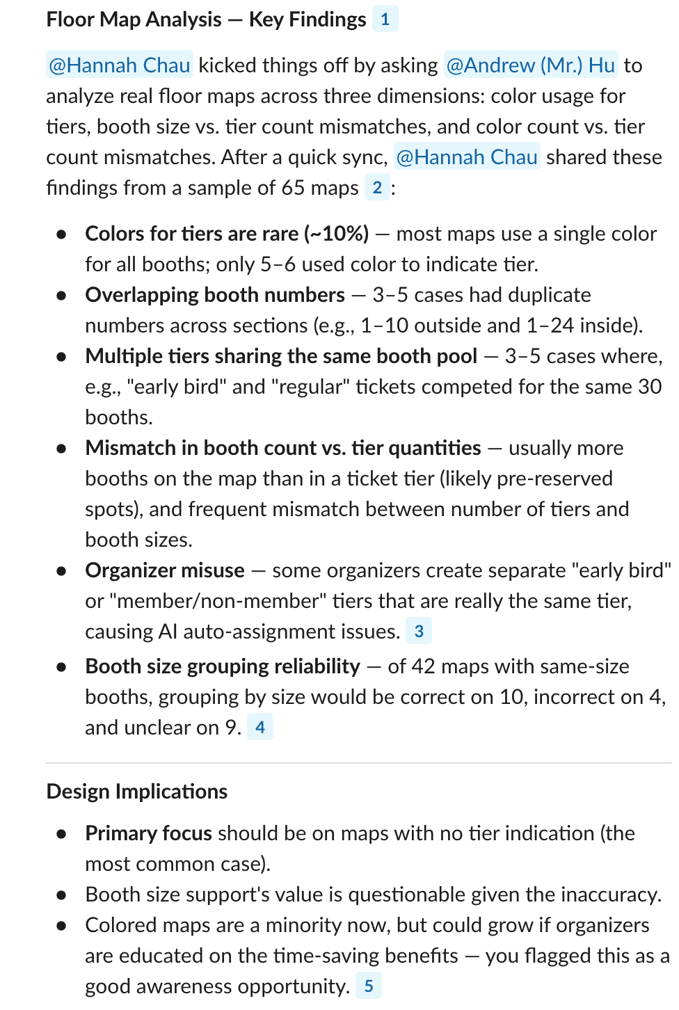
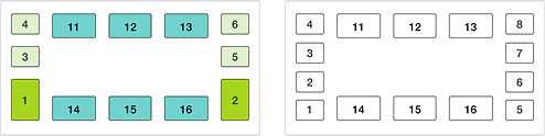
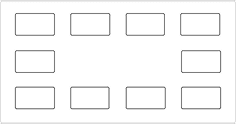
In the 65 maps we pulled from actual events, three types emerged based on how much detail they carried:

15%

15%

had color- or size-coded tiers plus booth numbers

had color- or size-coded tiers plus booth numbers

had color/size-coded tiers plus booth numbers

65%

65%

had booths in a single color or size, plus numbers

had booths in a single color or size, plus numbers

20%

20%

had nothing but booth outlines.

had nothing but booth outlines.

SOURCE

01 Slack discussion synthesis

01 Slack discussion synthesis

02 Sample map showing detection confidence

02 Sample map showing detection confidence

03 Prompt exploration with Gemini

03 Prompt exploration with Gemini

04 Map types and edge cases summary from Claude

04 Map types and edge cases summary from Claude

INSIGHTS

01

The flow would need to branch by case, with graceful fallbacks when detection fell short.

DESIGN IMPLICATION

Detection quality varied wildly by map type

Color-tier maps worked well, but size-based grouping often needed correction. Numbered-only maps were reliable at high resolution and fragile at low.

DESIGN IMPLICATION

The flow needs to branch by case, with fallbacks when detection fell short.

02

The design would let organizers confirm and clean up detection results before anything committed.

DESIGN IMPLICATION

Unpredictability of organizers' map input

Organizers sometimes include booths they aren't selling, or number non-booth items like stages and info tables. Detection is accurate, but relevance isn't something we can decide for them.

DESIGN IMPLICATION

The design needs to let organizers confirm and clean up detection results before anything was committed.

Design Principles

Design Principles

Design Principles

Handling the hard work behind the scenes, so organizers can focus on the tasks that matter.

Handling the hard work behind the scenes, so organizers can focus on the tasks that matter.

The core design challenge was making the result review feel effortless. My goal was to build enough trust that organizers didn't need to understand the system. And enough clarity that reviewing AI output didn't feel like more work.

I anchored the design around three principles:

01

Progressive disclosure based on user decisions

Asking users to review all detection output at once would be overwhelming; showing too little would make it hard to make decisions. The design should focus each screen on one decision that moves setup forward.

02

Human-in-the-loop

Even when detection is confident, users should have the final say and the ability to adjust results at key steps.

03

Design for the edges, not just the happy path

Real event maps are unpredictable. Major edge cases surfaced in the audit need a designed fallback that let users continue setup, not an error state that stopped them.

Scoping

Scoping

Scoping

How might we help organizers set up their booth map faster, even when their map isn't perfect and detection isn't either?

How might we help organizers set up their booth map faster, even when their map isn't perfect and detection isn't either?

With the principles set, the next question was how they'd hold up against real event maps.

Low confidence booth detection due to blurry maps

Colors ≠ tiers

Non-booth items with numbers

Booths already claimed before setup

Size detection isn't always accurate

The edge cases weren't evenly distributed. Each map type gave detection a different level of information, and that changed what organizers needed to do next:

  • Color/size maps → Detection suggests groupings; organizers bulk-assign.

  • Numbers-only maps → No grouping; organizers assign one by one.

  • No detection → Manual setup fallback.

After walking through a few flow options with the PM, we landed on three branches for the three detection outcomes. All of them converge on the same review-and-manage dashboard.

USER FLOWS THAT ADAPTS TO WHAT THE DETECTION RETURNS

With the flow set, I built a matrix mapping every step against every case, putting user story, design requirements, edge cases, and constraints in one place. I brought it to the PM and we worked through the edge cases together, deciding which had to ship at launch and which could wait.

DESIGN SPECS

Design decision 1

Design decision 1

Design decision 1

Rethinking the map upload step as the start of the new experience

Rethinking the map upload step as the start of the new experience

To introduce organizers to smart detection and prepare them for what was coming, I made two changes to set expectations:

01

Guidance on what details speed up setup

Asking organizers to select what their floormap looks like gave them a chance to learn what works with smart detection.

02

Real-time detection updates

After upload, a progress state showed the system working on the booth detection, so organizers weren't left wondering whether anything was happening.

Before - simple file uploader

Before - simple file uploader

After

After

After

Design decision 2

Design decision 2

Design decision 2

Walking organizers through booth assignment when the map has different levels of information to work with.

Walking organizers through booth assignment when the map has different levels of information to work with.

AI detection is fast, but it isn't always right. Real maps in our sample were sometimes blurry, contained non-booth numbers (like table numbers or room labels), or included booths the AI missed entirely. That created a real design question: how much editing should we let organizers do at the review step?

FLOW EXPLORATION

How should the detection results be presented?

Reviewing detection results is a decision moment, so the layout had to make that clear. I explored three ways to surface it and tested with the internal team. In the end, we pickedthe modal split view that gave the review its own space without competing with the dashboard for real estate.

LAYOUT EXPLORATION

How should organizers move through tier assignment?

With the 'review detection results in modal' behavior locked in, I moved on to how organizers should move through it. For maps with booth color/size, the flow needed to walk organizers through detected booth groups. For numbers-only maps, it needed to walk them through individual booth-tier instead. Across both cases, I designed around the same two criteria: scannability and speed to decision.

Maps with booth color/size

Maps with booth numbers only

MAPS WITH BOOTH COLOR/SIZE

Explorations

All booth groups on one screen

Gave organizers a complete overview, but the screen got overwhelming for maps with many groups.

Group-by-group wizard

Focuses each decision to one group at a time, but hard to go back and forth if a group needs editing.

Final design

Collapsible list

Scannable at a glance, focused when expanded, and organizers can jump into any group without walking a sequence.

Maps with booth numbers only

01

Combining steps 2 and 3 into a single dashboard. All paths (smart booth detection or manual setup) land here.

02

Tiers, pins, and descriptions all editable in one view.

Maps with numbers and tier info

01

Combining steps 2 and 3 into a single dashboard. All paths (smart booth detectio or manual setup) land here.

02

Tiers, pins, and descriptions all editable in one view.

Design decision 3

Design decision 3

Design decision 3

Unify the experience across four map cases and two setup paths

Unify the experience across four map cases and two setup paths

With detection and assignment designed case-by-case, the risk was ending up with what felt like four different products under one feature. I audited each path for overlap and consolidated the pieces that could work the same way regardless of how organizers got there.

Before

01

Setup split across three steps: upload, customize tiers, place pins.

02

Editing a pin color or tier description meant navigating back to an earlier step.

After

01

Combining steps 2 and 3 into a single dashboard. All paths (smart booth detectio or manual setup) land here.

02

Tiers, pins, and descriptions all editable in one view.

Trade-offs

The dashboard is denser than any single step in the old flow, but it gives organizers a holistic view of their tiers and booths in one place. Every action lives where organizers are already looking, without jumping between steps to edit different info.

Takeaways.

Takeaways.

Takeaways.

Trust is built through outcomes, not evidence.

Trust is built through outcomes, not evidence.

One thing I didn't expect going in was how little users needed to see of the AI's actual work. I'd assumed transparency was the key to trust — showing confidence scores, explaining how the system got there. But watching organizers move through the flow, it became clear they weren't looking for proof. They were looking for something that made sense at a glance. Once the extracted booth numbers and suggested groupings looked right, they trusted it. The reasoning behind it didn't need to be on the screen. That reframed a lot of my instincts for future AI work.

One thing I didn't expect going in was how little users needed to see of the AI's actual work. I'd assumed transparency was the key to trust — showing confidence scores, explaining how the system got there. But watching organizers move through the flow, it became clear they weren't looking for proof. They were looking for something that made sense at a glance. Once the extracted booth numbers and suggested groupings looked right, they trusted it. The reasoning behind it didn't need to be on the screen. That reframed a lot of my instincts for future AI work.

One thing I didn't expect going in was how little users needed to see of the AI's actual work. I'd assumed transparency was the key to trust, but watching users move through the flow in testing, I realized they weren't looking for proof but for something that made sense at a glance. Once we extracted booth numbers and suggested groupings looked right, they trusted it. The reasoning behind it didn't need to be on the screen.

Design for the messy middle, not the ideal case.

Design for the messy middle, not the ideal case.

It was tempting early on to design around the "perfect" map — the color-coded, cleanly numbered one where AI could do almost everything. But the research kept pulling me back to the middle case, which applied to most events but felt less exciting to solve for. Learning to sit with that and treat it as the primary experience, not a fallback, ended up being one of the more important shifts on this project. The ideal case makes a great demo. The middle case is what actually makes a difference.

It was tempting early on to design around the "perfect" map — the color-coded, cleanly numbered one where AI could do almost everything. But the research kept pulling me back to the middle case, which applied to most events but felt less exciting to solve for. Learning to sit with that and treat it as the primary experience, not a fallback, ended up being one of the more important shifts on this project. The ideal case makes a great demo. The middle case is what actually makes a difference.

San Diego, CA.

© 2026  Xiaochen(Iris) Shi

San Diego, CA.

© 2026  Xiaochen(Iris) Shi

San Diego, CA.

© 2026  Xiaochen(Iris) Shi

© 2026  Xiaochen(Iris) Shi